


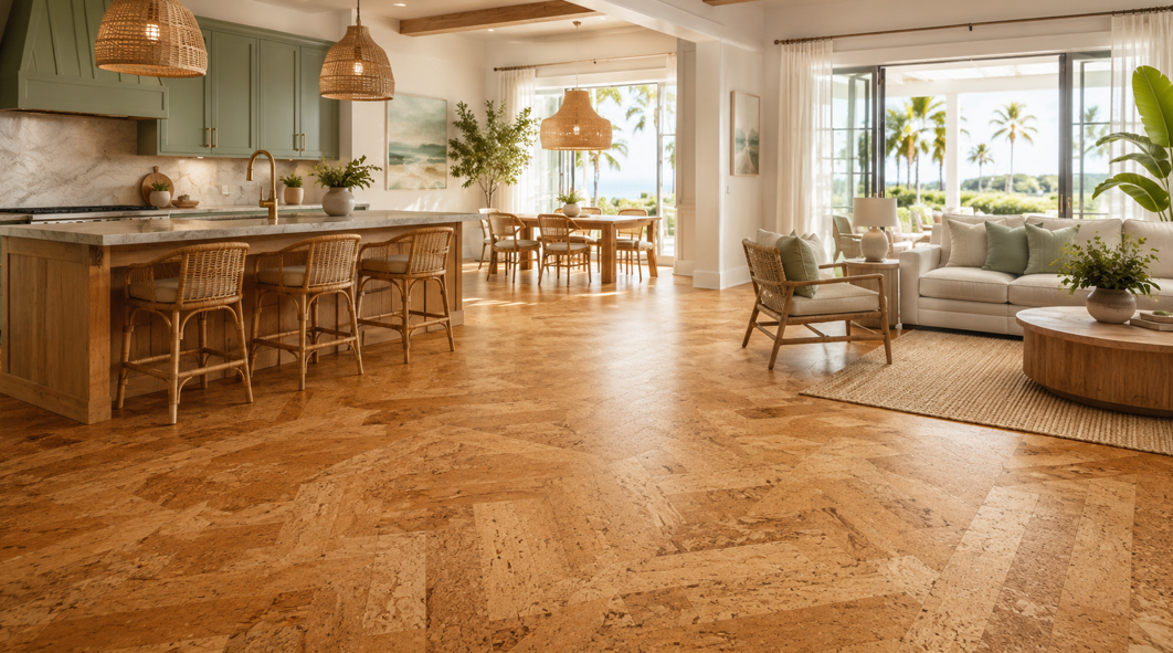
Cork Flooring Is Moving Beyond the Familiar Natural Look
Ask someone to picture cork flooring, and they may imagine a simple tan surface with a lightly speckled pattern. That classic appearance is still available, but it is no longer the only direction homeowners can explore. Today’s cork floors can look warm and organic, clean and contemporary, richly textured, or graphic enough to become a room’s main design feature.
For homeowners in Bradenton and Plant City, that range is especially useful. Florida interiors often need to balance bright natural light, relaxed living, practical comfort, and a style that still feels polished. Cork can fit that balance beautifully because it brings visible warmth without requiring a heavy or formal look.
At Williford Flooring Company Inc., homeowners can compare cork colors, formats, finishes, and installation options with an experienced local team. The company has served the Lakeland area since 1946, and every installation is handled by its trusted in-house crew rather than subcontractors. That consistency matters when the floor includes directional planks, patterned tiles, borders, or other details that need careful placement.
So, what is changing for 2025–2026? The strongest direction is personal rather than one-size-fits-all. Homeowners are choosing warmer natural tones, softer neutrals, matte finishes, visible texture, and layouts that reflect the shape and character of the room.
The goal is not to chase a passing look. It is to find a cork floor that feels current now and still works with the home for years.
1. Warm Natural Cork Colors Are Leading the Way
Warm color is returning to the center of interior design. After years of cool gray flooring dominating many remodels, homeowners are leaning toward shades that make a room feel comfortable, grounded, and welcoming.
Honey, Wheat, and Light Golden Tones
Light golden cork is one of the easiest ways to keep a space bright without making it feel stark. Honey, wheat, amber, and pale caramel tones bring out cork’s natural character while pairing comfortably with many popular finishes.
These colors work especially well with:
Warm white or cream walls
Light oak or maple cabinetry
Natural linen and woven fabrics
Soft blue, sage, and sandy beige accents
Rattan, cane, and other organic materials
In a Bradenton home with generous sunlight, a warm golden floor can create an airy coastal feeling without relying on obvious beach-themed décor. The look feels more refined when the room uses texture, calm color, and natural materials instead of seashell motifs or bright nautical accents.
Caramel and Toasted Brown
Caramel, chestnut, toasted brown, and light cocoa offer more visual weight. These shades can help connect multiple areas in an open-plan home, especially when the kitchen, dining room, and living room share one continuous floor.
Medium cork colors pair well with off-white cabinets, warm stone counters, bronze or black hardware, and muted green or terracotta accents. They are also flexible enough to work with both traditional and updated furniture.
Deep Earth Tones
Darker cork in espresso, umber, or deep walnut can create a dramatic foundation. These colors often work best in rooms with strong natural light, pale walls, or large areas of visible floor.
A deep floor can make light cabinetry stand out and give a dining room, office, or primary bedroom a more tailored appearance. At the same time, darker flooring may show dust, pet hair, or surface marks more readily than mid-tone options.
Homeowners may want to compare samples under real household conditions before making a final selection.
2. Soft Neutrals Are Giving Cork a Contemporary Feel
Does cork flooring always have to look rustic? Not at all. One of the most useful 2025–2026 directions is the rise of soft, understated neutrals that let cork work in modern and minimalist rooms.
Cream, Sand, and Light Beige
Cream, sand, and pale beige cork can make a room feel calm and spacious. These colors are especially effective when the goal is to create a clean backdrop for cabinetry, furniture, and artwork.
They coordinate naturally with:
White or light wood kitchens
Quartz and lightly veined countertops
Soft green, blue, or clay-colored accents
Minimalist furniture
Natural textiles and simple window treatments
Greige, Taupe, and Mushroom
Warm gray-beige shades are a useful alternative to the colder gray floors common in earlier design cycles. Greige, taupe, and mushroom sit between warm and cool, which gives homeowners more flexibility when they are not replacing every finish in the room.
What happens when a beautiful sample looks completely different beside your cabinets? Lighting is often the reason. A neutral cork sample may look beige in the morning, slightly gray at midday, and warmer again under evening lamps.
Viewing samples in several areas of the room helps reveal those shifts before installation.
Soft Whitewashed Looks
Whitewashed cork keeps some of the material’s natural texture while giving the floor a lighter, more contemporary appearance. It can suit Scandinavian-inspired rooms, modern coastal homes, and interiors that use soft woods with simple furniture.
The best whitewashed looks still show enough variation to avoid appearing flat. A low-sheen finish can help the material feel natural, while a highly glossy surface may change the overall character.
3. Organic Texture Is Becoming More Important Than Perfect Uniformity
One of cork’s greatest design strengths is its natural variation. Rather than asking every plank or tile to look identical, many homeowners are choosing surfaces with visible movement, granules, and tonal shifts.
Natural Speckling and Visible Granules
Traditional cork speckling is gaining fresh appeal because it gives the floor depth without relying on bold color. The natural pattern can make each section feel distinctive while still creating a cohesive room.
Visible granules may also soften the appearance of everyday dust or minor marks, although that depends on the product’s color and finish. A high-contrast pattern will behave differently from a quiet, blended one.
Linear and Striated Patterns
Some modern cork products feature directional lines or compressed textures that create a more elongated look. These patterns can visually stretch a hallway, reinforce the flow of an open-plan room, or make a small space feel more dynamic.
Installation direction makes a noticeable difference. Planks running toward a main window can draw the eye through the room, while planks laid across a narrow space may help it feel wider.
Doorways, sightlines, and the room’s longest wall also influence the best orientation.
Marbled and Mottled Effects
Marbled cork uses clouded movement, mottled color, or layered tones to create a more artistic surface. It does not need to imitate stone exactly. Instead, it borrows the sense of movement and variation that makes natural materials visually engaging.
Matte and Low-Sheen Finishes
Matte and low-sheen finishes remain a strong fit for 2025–2026 because they present cork in a more natural way. They also support the current preference for softer, quieter interiors.
A matte surface can make warm colors feel richer and reduce the polished look associated with earlier flooring styles. Homeowners can compare finish samples alongside cleaning and maintenance guidance, since appearance is only one part of the decision.
4. Patterned Layouts Are Turning Cork Floors Into a Design Feature
The color of each plank or tile matters, but the layout can have just as much influence. A restrained cork color arranged in an unexpected pattern can feel more customized than a bold color installed in a standard grid.
Today’s cork flooring options can support classic, contemporary, and highly personalized interiors, depending on the product format and manufacturer guidance.
Classic Square Tiles
Square cork tiles can create a clean, structured grid. In one consistent color, they feel calm and orderly. With two coordinating tones, they can produce more rhythm and movement.
Soft Checkerboard Patterns
Checkerboard flooring is returning in a gentler form. Instead of harsh black and white, homeowners are using related cork shades such as:
Cream and warm tan
Honey and caramel
Sand and mushroom
Natural cork and deep brown
The reduced contrast makes the pattern easier to live with. It adds personality while still allowing cabinets, rugs, and furniture to share attention.
Is a bold pattern right for the whole room, or would it work better in a defined area? In many homes, a checkerboard layout is most effective in an entry, home office, breakfast nook, or another zone with clear boundaries.
Staggered and Brick-Look Layouts
Rectangular cork tiles can be offset to create a brick-like pattern. This layout offers more movement than a straight grid but remains visually simple.
Herringbone and Geometric Influence
Herringbone-inspired and parquet-like arrangements can make cork look especially tailored. These patterns bring direction and craftsmanship to the floor, which can elevate a living room, dining room, or luxury bedroom.
Not every cork product is suited to every geometric layout. Dimensions, edge profiles, locking systems, and installation instructions all matter. More detailed patterns also require accurate cuts and careful alignment.
Williford Flooring Company Inc. uses an in-house installation team, which helps maintain consistent quality from planning through completion. For a patterned floor, that continuity can make a visible difference.
Borders and Zoned Designs
A contrasting border or layout change can define a dining area, reading corner, or entry within an open-plan home. Used with restraint, this approach adds structure without requiring walls.
5. Matching Cork Trends to the Style of Your Home
A trend becomes useful only when it fits the home. Bradenton and Plant City include coastal, traditional, transitional, mid-century, farmhouse, and contemporary properties, so the same cork floor will not suit every interior.
Coastal and Relaxed Florida Interiors
Light honey, wheat, sand, and pale beige work naturally in relaxed Florida rooms. Pair them with warm white walls, soft blue or sage accents, linen, cane, and light wood.
A subtle grain or quiet speckled pattern usually fits better than a highly dramatic surface. The result feels bright and comfortable without becoming themed.
Traditional and Transitional Homes
Caramel, chestnut, and warm medium brown provide enough depth for classic furniture and detailed trim. A straight plank layout, square tile grid, or restrained border can preserve a sense of order.
Modern and Minimalist Spaces
Mushroom, taupe, pale washed finishes, and dark monochromatic cork can all support a modern interior. The key is to keep the color palette controlled and let texture create interest.
Linear patterns can reinforce clean architecture, while matte finishes reduce visual glare. Simple furniture and large areas of open floor allow the material to be appreciated.
Mid-Century and Retro-Inspired Rooms
Natural amber cork, square tiles, and soft checkerboard patterns feel especially at home in mid-century spaces. Cork already has a warm, design-forward character that works with walnut furniture, tapered legs, and graphic artwork.
Farmhouse and Organic Interiors
Warm browns, visible granules, and understated plank layouts can complement farmhouse and organic interiors. These rooms often benefit from honest materials and texture rather than heavily distressed finishes.
Medium cork tones work well with painted cabinetry, natural wood tables, simple metal fixtures, and earthy textiles.
6. How to Choose a Cork Color and Pattern That Lasts Visually
A trend forecast offers inspiration, but flooring is a long-term part of the room. The final selection needs to work with the home after current design conversations move on.
Begin With Fixed Features
Start with the elements that are unlikely to change soon:
Kitchen cabinets
Countertops
Fireplace materials
Built-in shelving
Interior doors
Stair components
Large furniture pieces
The floor does not need to match every finish. It only needs to relate to the room in a way that feels intentional.
A warm cork may echo the grain in cabinetry, while a mushroom neutral may connect with both stone counters and beige upholstery.
Check the Undertone
Undertone is the quiet color beneath the main color. A brown floor may lean golden, red, gray, or neutral. That difference affects how it sits beside paint, wood, and stone.
Golden cork often pairs well with cream and warm woods. Mushroom cork can coordinate with greige walls and mixed metals. Deep brown creates clear contrast against pale cabinetry.
Study the Natural Light
Florida sunlight can be strong, and it changes throughout the day. A pale floor may appear brighter near a large window and warmer in a shaded corner. A dark sample may feel rich in daylight but heavier under limited evening lighting.
Place samples in several positions and view them in morning, afternoon, and evening conditions. This simple step can prevent a color surprise after installation.
Consider Pattern Scale
Large, high-contrast patterns attract attention. Small, blended textures create a quieter background.
The right scale depends on:
Room size
Amount of visible floor
Existing fabric and wallpaper patterns
Cabinet and furniture detail
Whether the floor is meant to lead or support the design
In a compact kitchen with patterned countertops, a subtle cork texture may create better balance. In a large, simple room, a stronger geometric floor may add welcome character.
Balance Current Style With Personal Preference
A floor can feel current without copying every trend. Homeowners may want to prioritize a color they genuinely enjoy, a pattern that suits the architecture, and a finish they can maintain confidently.
Bring the Right Cork Look Into Your Bradenton or Plant City Home
The leading cork flooring direction for 2025–2026 is warm, natural, and personal. Honey and caramel tones are creating more welcoming interiors. Soft beige, mushroom, and pale washed colors are helping cork move into contemporary spaces.
Visible texture, matte finishes, checkerboard layouts, and geometric patterns are giving homeowners more freedom to create a distinctive look.
The best option is not always the boldest one. It is the color and pattern that work with the room’s light, fixed finishes, architecture, and daily use. Product construction, finish, installation method, and maintenance guidance all deserve consideration alongside appearance.
Williford Flooring Company Inc. has decades of experience helping Florida homeowners choose beautiful, reliable flooring and complete the installation with a dedicated in-house team.
To compare samples and discuss a cork floor for your Bradenton or Plant City home, get in touch with the local flooring specialists.


